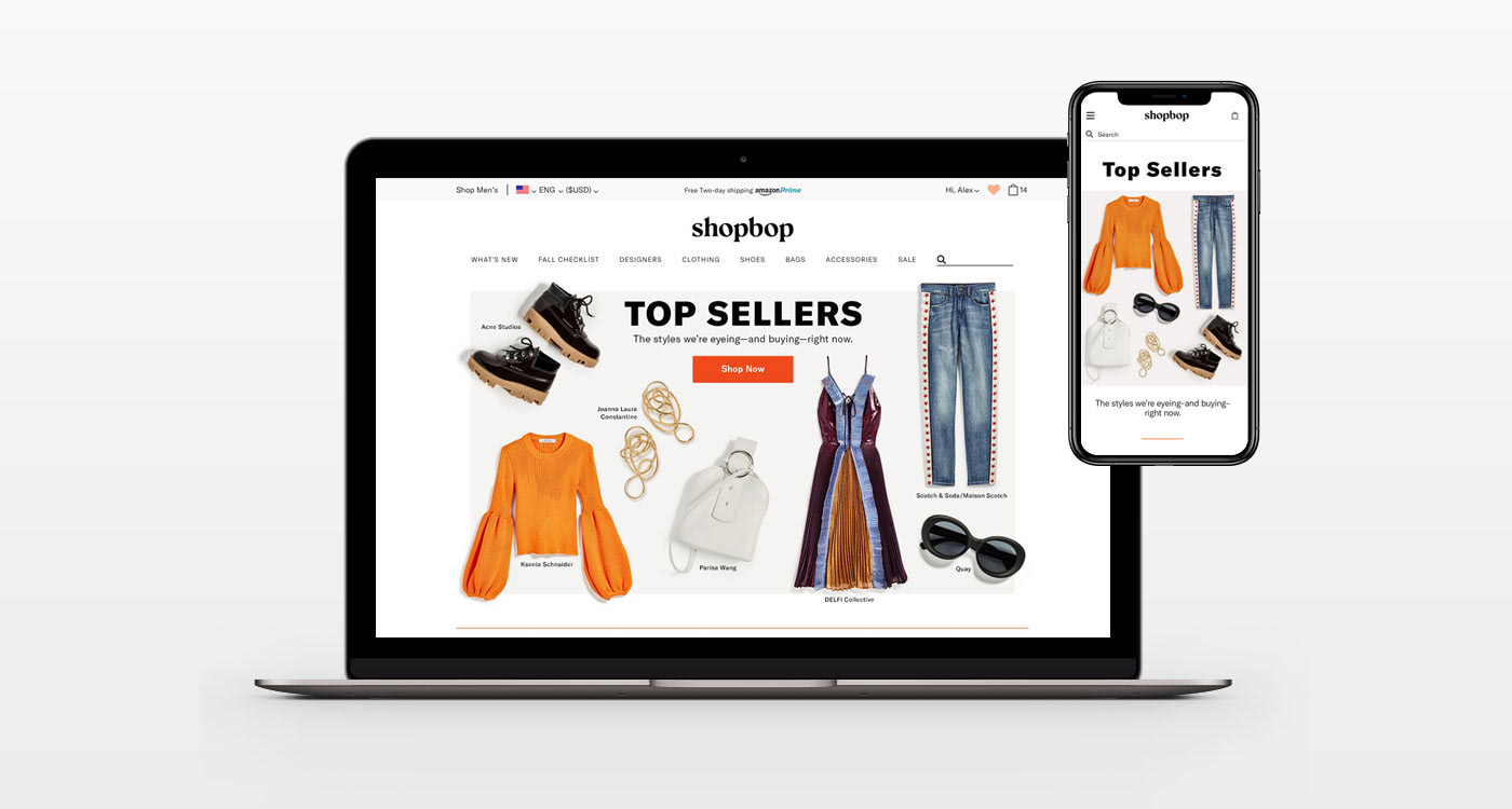
Shopbop Rebrand—Homepage Redesign
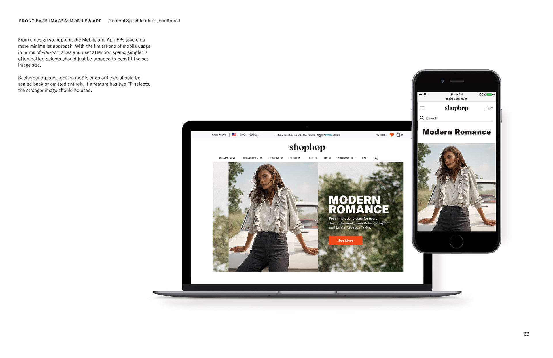
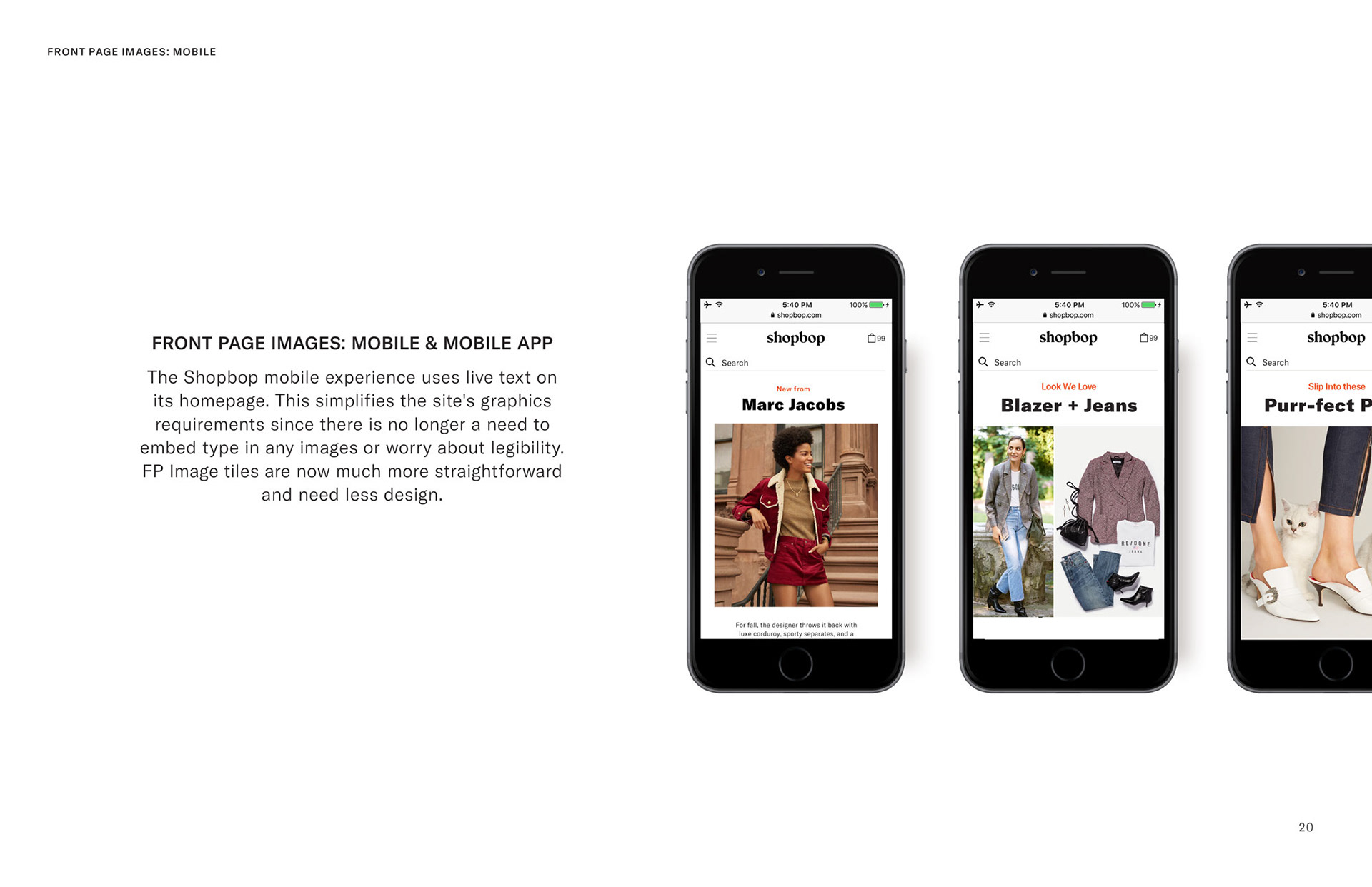
I was brought in to help extend and implement Shopbop's newly-revamped brand identity (created by an external agency), and this included updating the website's homepage UI, the gateway point for Shopbop's ecommerce business. Core layout and functionality were carried over from the site's previous design, but updated with new details. Image sizes and proportions were tweaked to optimize new hero image photography, and included new full-screen options. New live text type treatments were also integrated into the site structure—particularly in its mobile version—for optimal legibility.
Separate desktop, mobile and app layouts were created since the shopbop.com is adaptive but not yet fully responsive.
Separate desktop, mobile and app layouts were created since the shopbop.com is adaptive but not yet fully responsive.
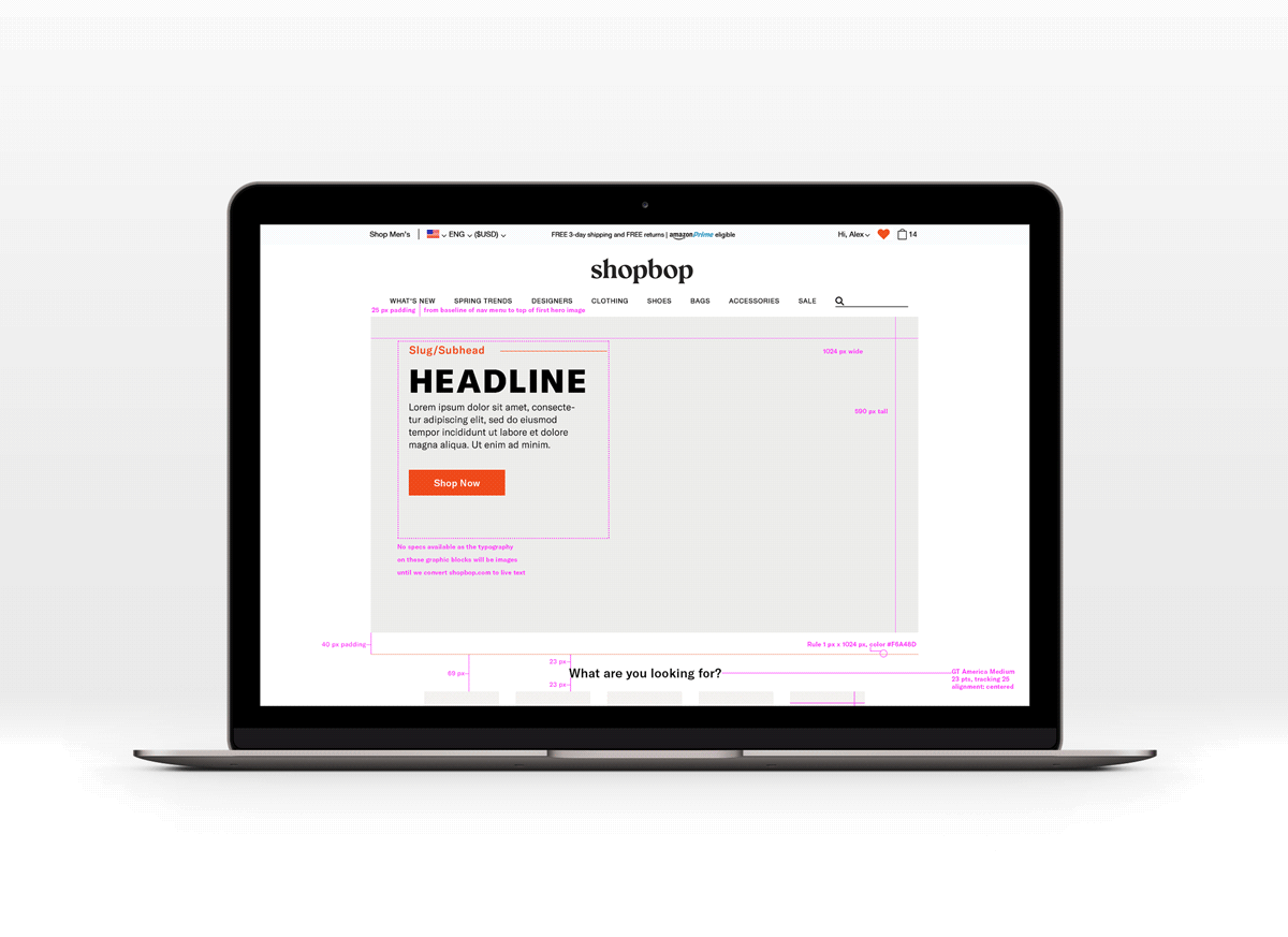
Wireframes showing structure, measurements and specifications of updated desktop homepage layout
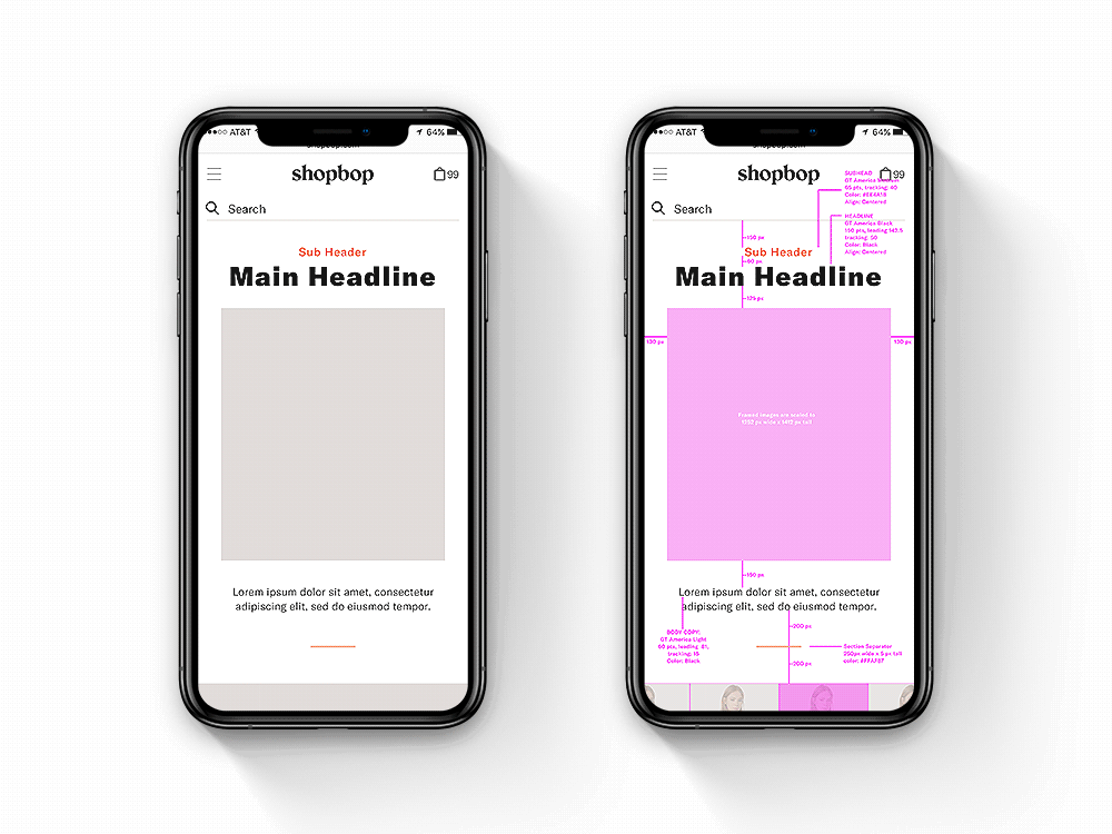
Wireframes showing structure, measurements and specifications of updated mobile homepage layout
Shopbop Rebrand—Front Page Image Style Guide
Shopbop's homepage is constantly being refreshed, with new features and call-outs added on a daily basis. These hero shots (called Front Page Images) are the main features that launch on the top spot on the homepage each day, and cycle down until they toggle out 4 days later. Because of the sheer volume of updates, standards needed to be established as part of the rebrand, to keep the design quality consistently high.
I created a style guide to document and maintain standards for the look and feel of these Front Page images, setting technical and aesthetic details as well as best-practice solutions for various design situations.
I created a style guide to document and maintain standards for the look and feel of these Front Page images, setting technical and aesthetic details as well as best-practice solutions for various design situations.
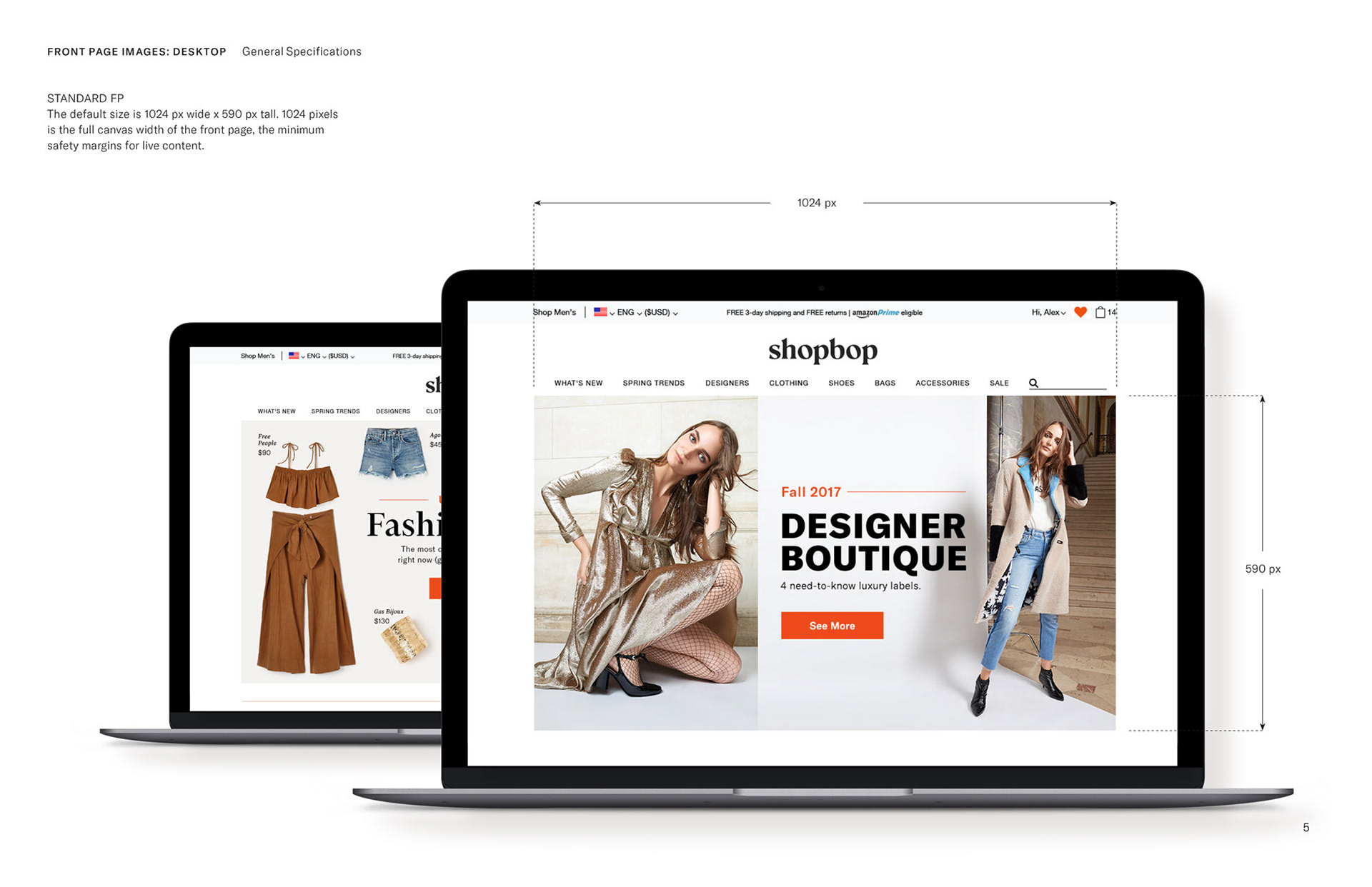
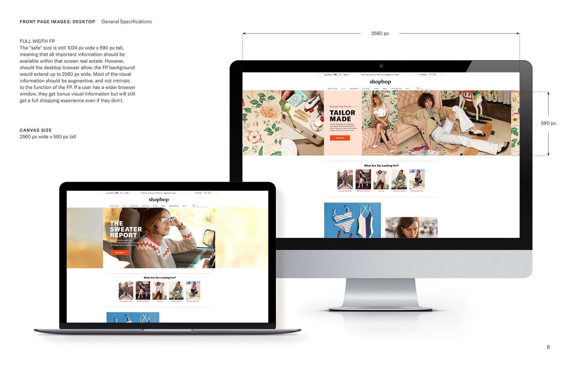
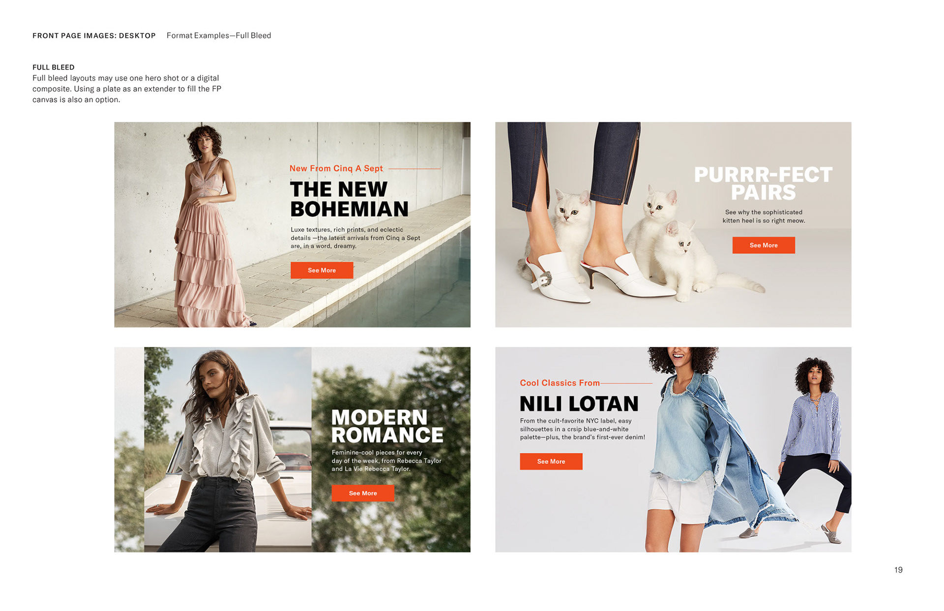
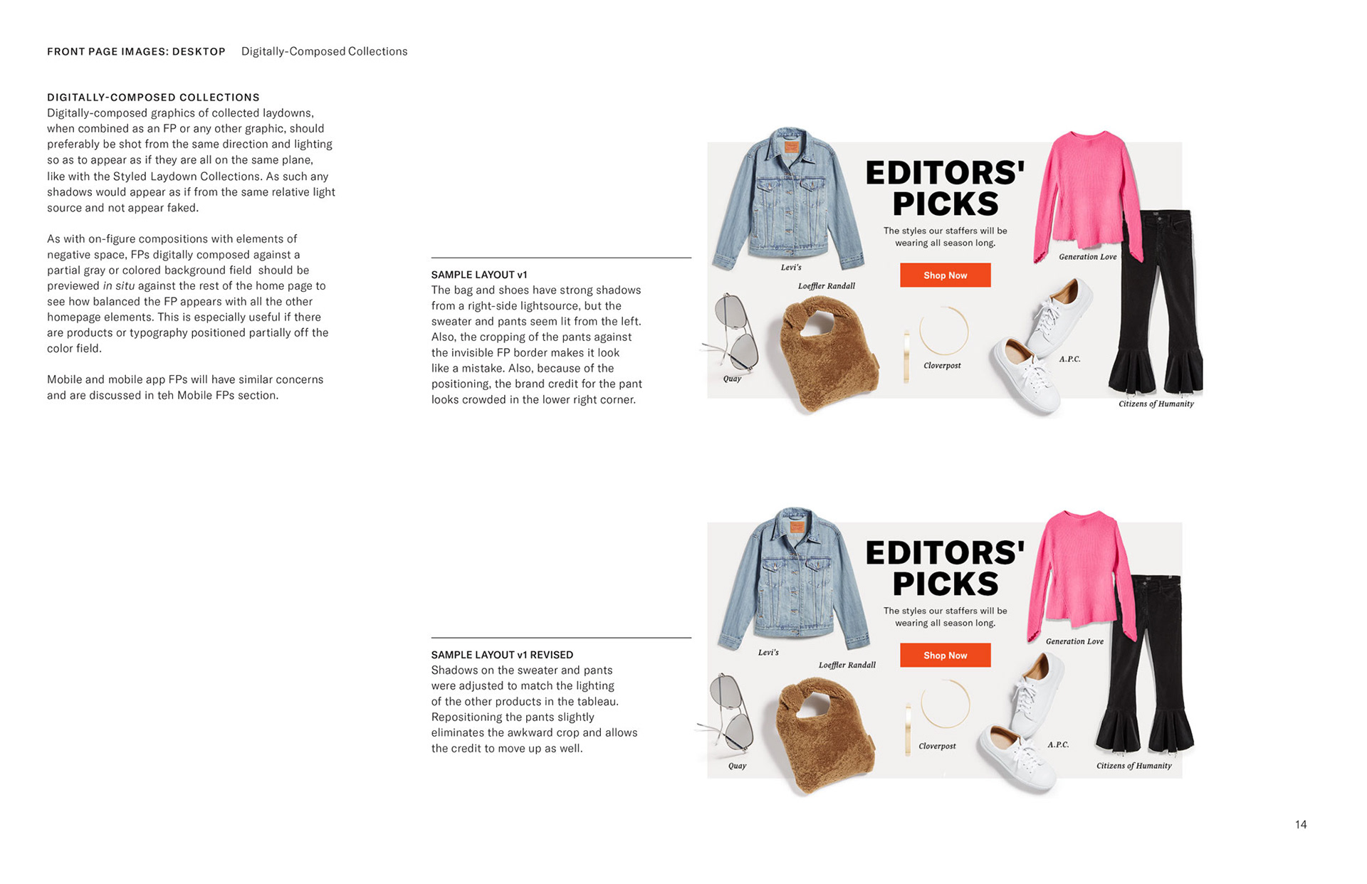
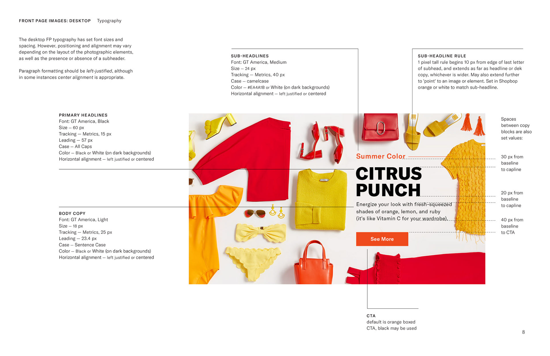
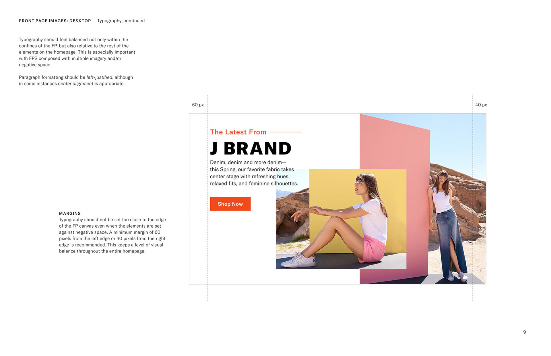
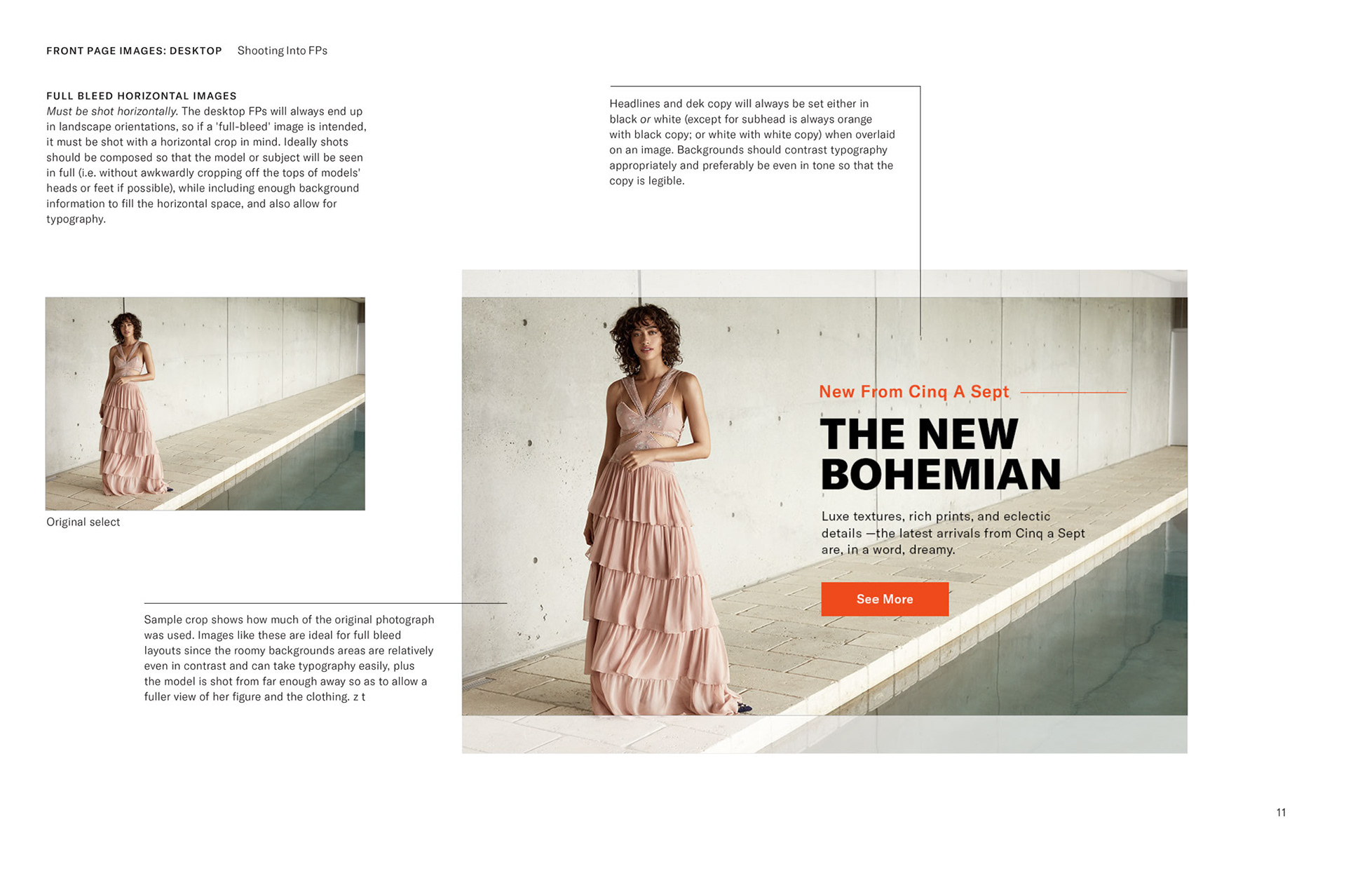
While the initial agency rebrand determined new brand typefaces and general typographic treatments, I set actual measurements and proportions for specific spaces and areas, such as on the FPs as seen here.
All content, placed photography and images courtesy of Shopbop/Amazon and used for portfolio purposes only, and may be removed at copyrights owner's request.