East Dane Sale Promo Graphics & Animations
East Dane, like its sister site Shopbop, would hold multi-day sale affairs. For East Dane’s quieter branding I introduced animated graphics that created added visual excitement during these periods. East Dane's site structure did not support video at that point so these were designed to be deployed as animated gifs. Online ad campaigns for the sales had to match the looks and designs as animated gifs worked well for ad banners.
"Wave" Tiered Sale Event
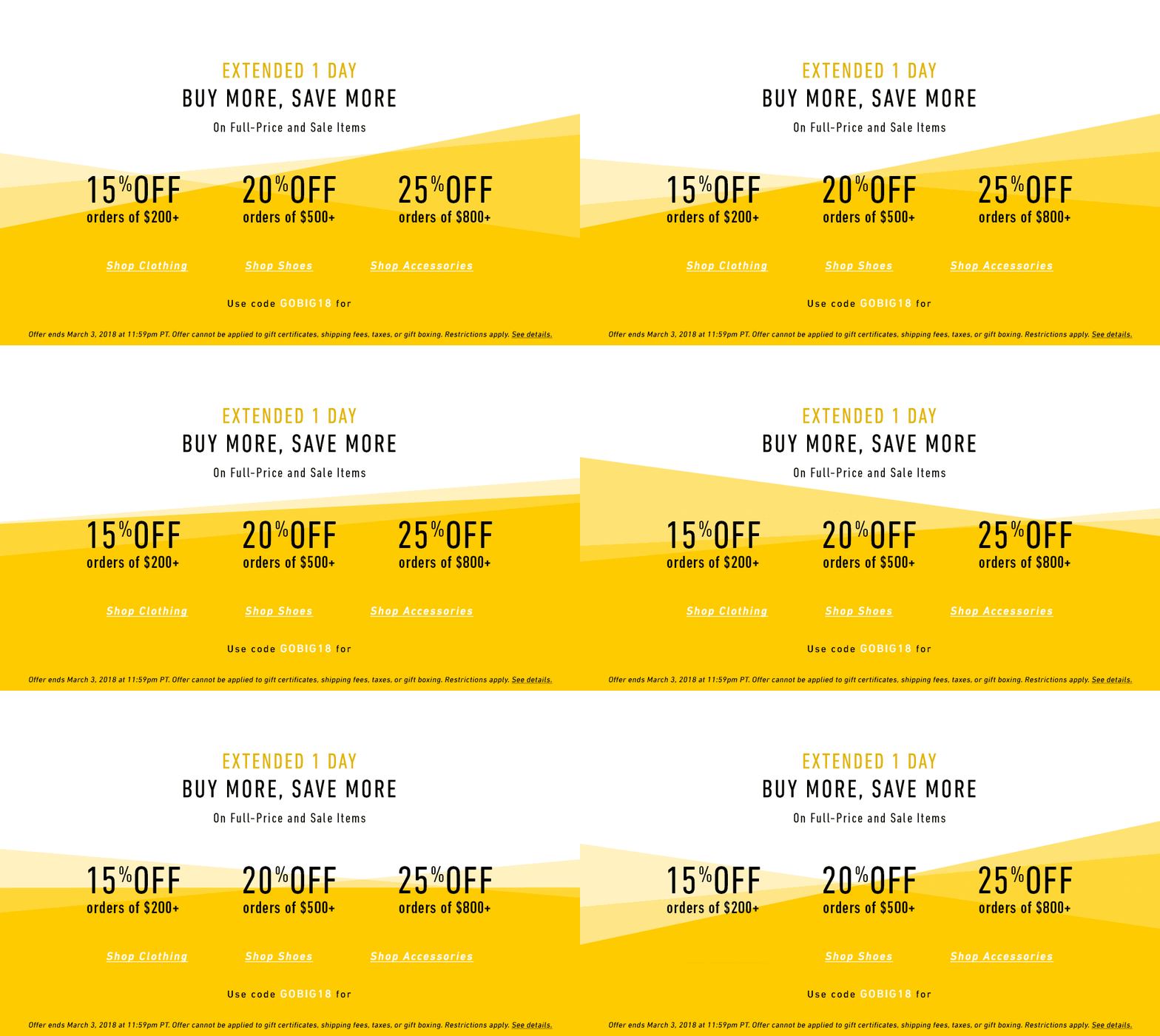
This "wave" graphic started out with East Dane's signature mallard brand color so that the animation was the main main novelty. Later in the sale an ultramarine blue replaced the mallard green, refreshing the event. Then the color completely popped into a bright yellow for an extension sale day.
This "wave" graphic started out with East Dane's signature mallard brand color so that the animation was the main main novelty. Later in the sale an ultramarine blue replaced the mallard green, refreshing the event. Then the color completely popped into a bright yellow for an extension sale day.
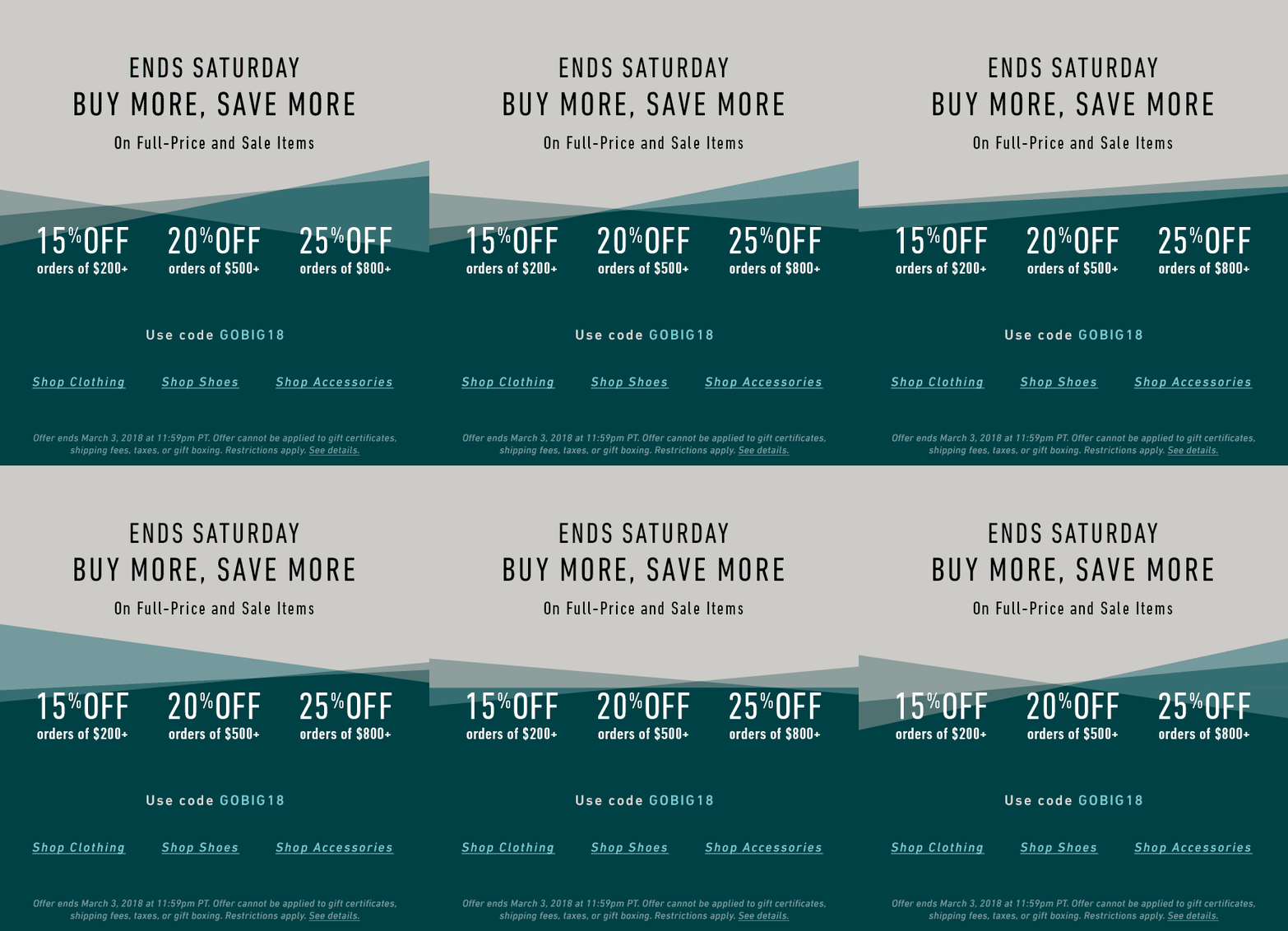
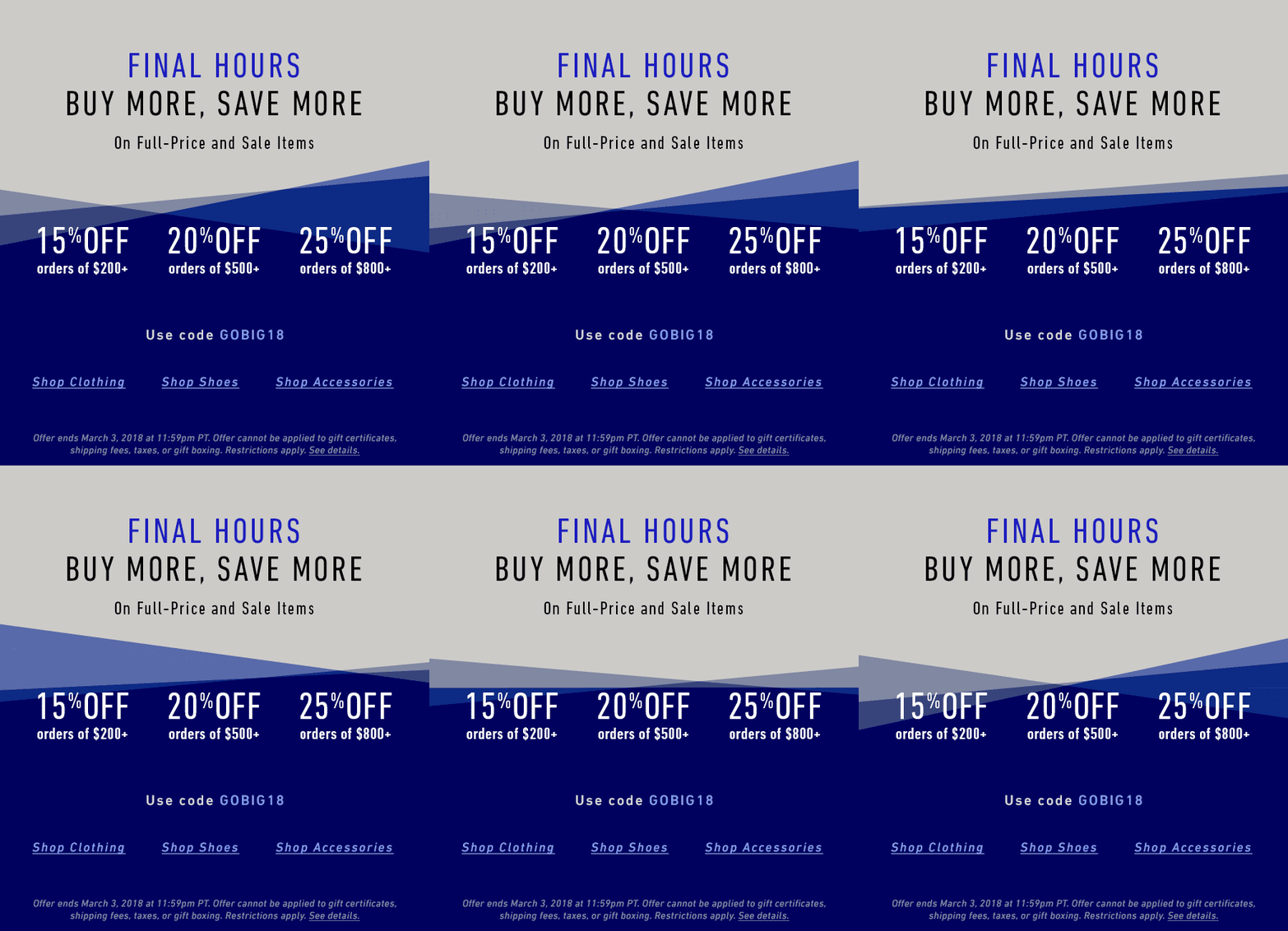
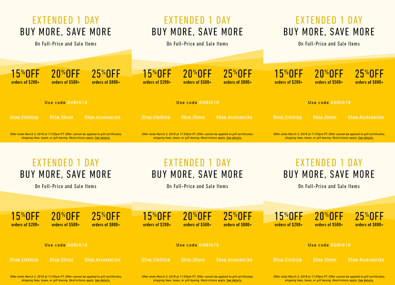
Tiered sale email graphics
The desktop main graphic on the first day of the tier sale (above), and the Last Day and Extended iterations below.
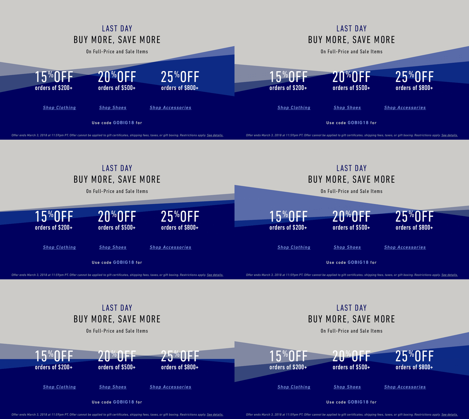
Ad Banners both externally as well as within the East Dane website were rendered as static graphics but with the visual still consistent with the animations and visually


“Black Friday” marks the biggest sale period of the year for many American retailers both online and off, as the days leading into it and afterwards in “Cyber Monday” are an almost week-long sale period. in order to build excitement and encourage return shopping without running into sale fatigue, the cadences for the sale visuals have to be carefully designed so that shopper expectations can be managed and encouraged by fresh graphics that feel new and worth exploring at different points in the period.
"Big Summer Sale" Sale Event
A simple but effective and emphatic typographic approach emphasizing the size of the sale. A clean animation kept things impactful but not too involved.
A simple but effective and emphatic typographic approach emphasizing the size of the sale. A clean animation kept things impactful but not too involved.
The animations were customized for each format, but anchored to the campaign by the typography and color scheme, and as animated gifs they were easily deployed.
Alternate design/animation ideas
All placed photography and images courtesy of Shopbop